Layout Manager
The Layout Manager in the Gantry-based theme administration interface provides several options for setting up the layout of the theme's Outlines.
Using the Load Button
Layout Presets enable you to quickly switch between pre-configured layouts for your site. These layouts are included in the theme and feature a different set of sections. Some layout presets may include a sidebar, or multiple sidebars, and a number of sections intended to fit a specific page style.
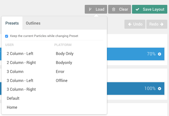
Each outline is assigned to a Layout Preset which can be reassigned using the Load button in the Layout Manager. Once you have selected this button, a pop-up will appear with two tabs, Presets and Outlines.
If you select a Preset, your layout will be replaced with a preset one that comes with the theme. These presets act as starting points for your design, giving you a set of Sections, Positions, and/or pre-placed Particles to work with. The presets have been configured to cover a range of possible layouts a user would want to use on their design, as set by the theme creator. This includes layouts with and without sidebars, and range from incredibly simple to complex.
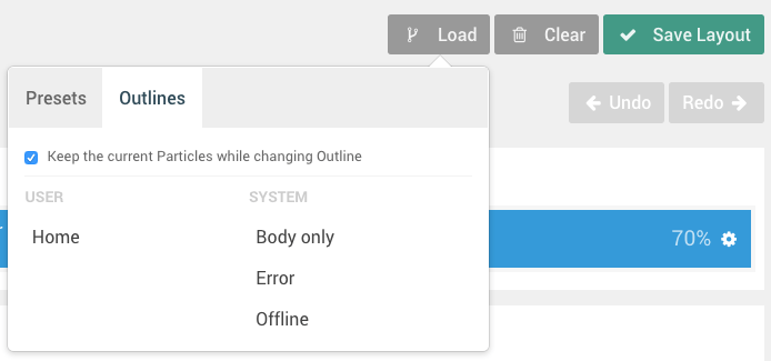
Selecting one of the Outlines options will copy the Layout Manager setup from the selected outline and load it into the one you are working in. This is a quick way to base your layout on another outline without having to manually duplicate it.
The Keep the Current Particles option gives you the ability to keep your presently-configured Particles and load the new preset with them intact. If you want to completely load a new preset, along with its own Particles, you will want to uncheck this option. This will remove any Particles you have configured and load the ones that are included in the preset.
Controls
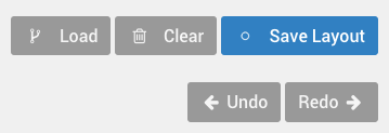
The Layout Manager has a number of useful controls to help you configure, save, import, and export your layouts. In this section, we will go over some of the things you will find in the Layout administrative panel.
Load
As covered in the above section, the Load button gives you the opportunity to load a Layout Preset based on pre-assembled presets included with the theme or on the Layout of another outline.
Clear
The Clear button wipes out the Particles (including Positions and Standard Particles) from the Layout Manager and gives you a blank slate with just the Sections remaining.
Clear does not clear inheritance. If you have any inherited sections, they will remain after clearing the layout. You can remove them manually by removing inheritance.
Save Layout
The Save Layout button is a quick and easy way to save the current layout, its Particles, and settings to the active outline. This is the button you would click before switching tabs to the front end and refreshing the page to check your changes.
History
The History buttons give you the ability to go back and forth between changes you have made in your Layout. This history is persistent through the current session, and makes it easy to go backwards and forwards, saving once you have reached a point you are happy with.
You can even go back after hitting Save Layout, should one of your changes not come out the way you expected after checking the front end.
Particles
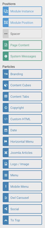
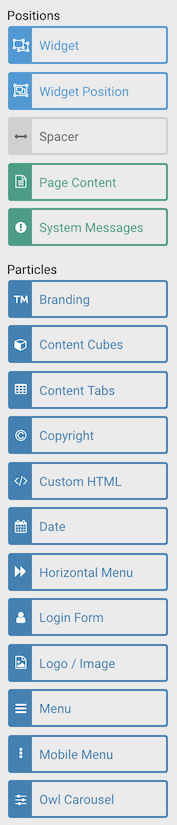
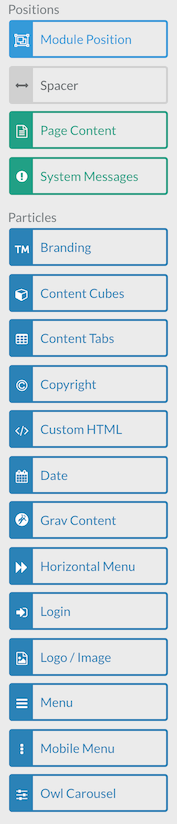
The Particles section (which appears along the left-hand side of the Layout Manager) is where you will find draggable Positions and Particles. You can perform a quick search in the Filter field to narrow down the list to find just the option you are looking for.
Once you have decided on an item you would like to apply to the layout, simply drag and drop it to the desired place on the Layout.
These items will apply based on their default settings as set in the Particle Defaults administrative panel for the active outline. You can override these settings and apply a unique, specific set of settings on each individual particle from the main Layout area of this panel.
You can find out all about particle inheritance in our Inheritance Guide.
Layout
The layout consists of several different sections, each with its own set of settings that enable you to customize the behavior and look of your site on the front end.
Sections
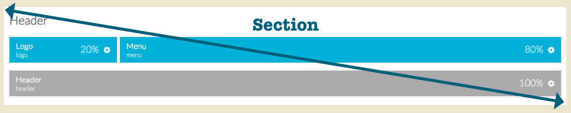
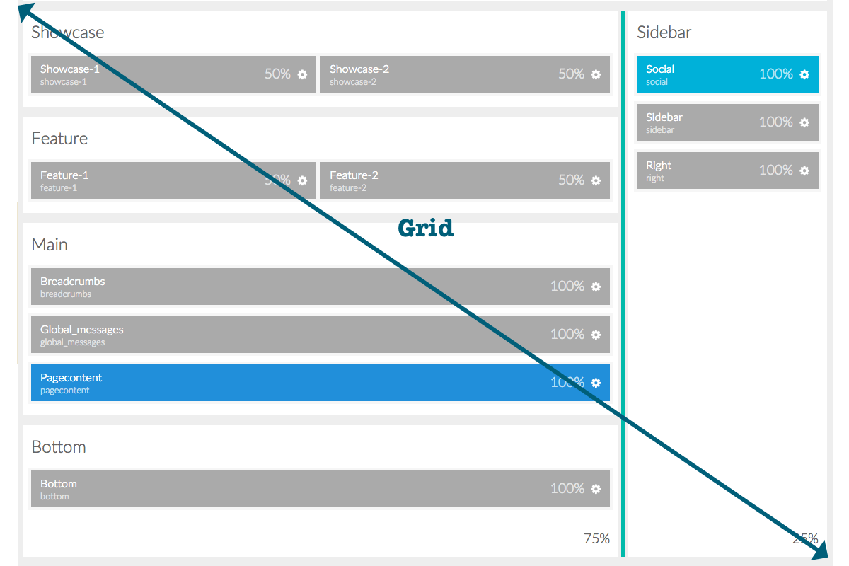
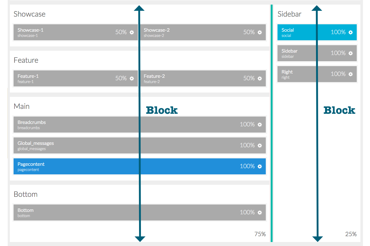
For the Layout, the most basic parts of the page are Sections. These named divisions of the page give you the ability to create sections of content, each with one or more horizontal grids on which you can place Blocks, including Particles and Positions.
You can add Grids by selecting the plus (+) icon in the upper-right corner of a Section. This will create a new row at the bottom of the Section which you can click and drag to move it as needed.
Find out more about inheritance in sections in our Inheritance Guide.
Settings
| Setting | Description |
|---|---|
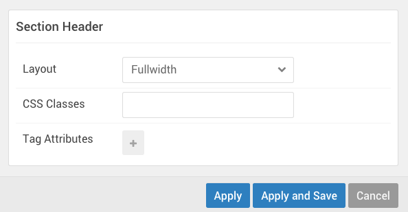
| Layout | Enables you to set a Fullwidth or Boxed layout for the section. |
| CSS Classes | Enables you to add a CSS class for the Section. |
| Variations | Clicking the field opens a dropdown, enabling you to select variation(s) to apply to the Section. |
| Tag Attributes | Enables you to add HTML attributes for the Section. |
The Section settings give you the ability to change the way a particular section renders and behaves on the front end. You can set the layout type, add custom CSS classes, or set HTML attributes and do things like change the way the section looks and add properties such as JS and other extras that aren't included in the base theme.
Grids
Grids are the horizontal rows in which Blocks live. In a Grid, you can place positions and particles.
Settings
Grids have very basic options. You can move them using the icon on the left-hand side or quickly even out Block widths by selecting the icon on the right-hand side.
Blocks
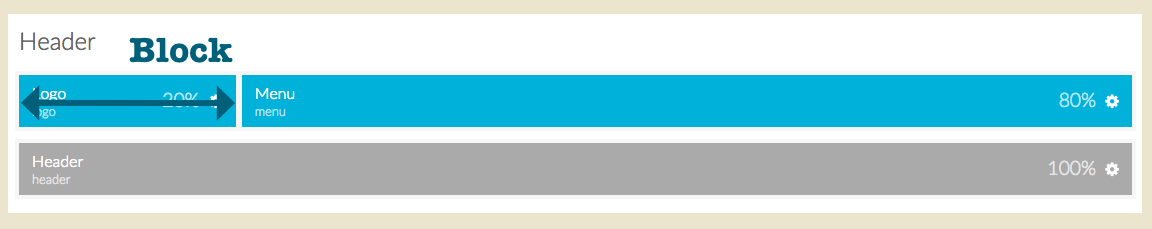
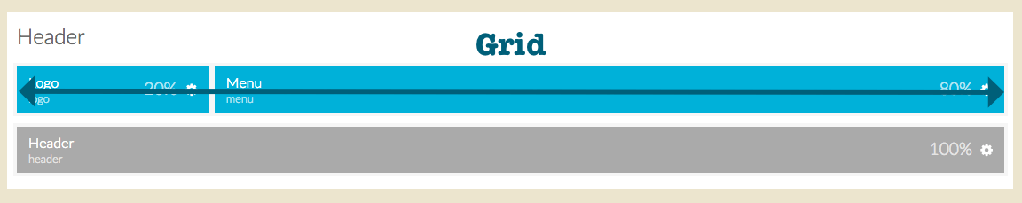
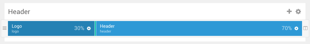
Blocks are the Lego bricks of the Layout Manager. These are your individual pieces which make up the individual parts of your page. Your Logo, for example, would be a Particle placed in a Block, which sits in a Grid within a Section.
Resizing Blocks in a Grid is a simple process. Simply move your mouse cursor (or tap your finger in a touchscreen) on the dividing line between blocks and drag it left or right, depending on how you want it to go.
Settings
Each block has its own settings, which can be accessed by selecting the cog-wheel icon on the right-hand side of the Particle. These settings override the default ones set in the Particle Defaults admin panel, and become unique to the single block.
These are Particle level settings, which exist in every type of Block. They enable you to rename the Particle as it appears on the Layout Manager, as well as to configure Particle-specific settings sourced from the Particle's YAML file.
| Setting | Description |
|---|---|
| CSS ID | Enables you to set an ID attribute. |
| CSS Classes | This is where you would enter any CSS class you would like to have apply to the block. |
| Variations | Clicking the field opens a dropdown, enabling you to select variation(s) to apply to the block. |
| Tag Attributes | This field is where you would add any other Tag attributes to the block. |
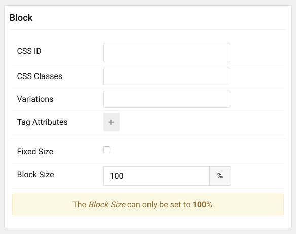
| Fixed Size | Fixed size means that the block will always take up the designated percentage of space - even if there are no other blocks in the row. |
| Block Size | This field gives you the ability to set a specific size (in percentage) the block will take up horizontally. |
The block settings make it easy to change the way a particular block looks and behaves, as well as gives you the ability to set a specific width percentage for the block.
The Fixed Size option is especially useful when you are using particles that you want to take up a specific area of the page. So, for example, if you have a logo and a menu particle in a row, and you want the logo to only take up 30% of the page - even if the menu is disabled - you can do so using the Fixed Size option.
Sidebar Blocks and Grids
In the presence of a Sidebar, there is a unique situation. For the purposes of theme development, the sidebar and any horizontally-adjoining Sections are placed in a single Grid. Unlike the smaller Grids which exist inside sections, this Grid can't be freely moved. However, you can resize them using the divider bar between the Sidebar and its adjoining Sections.
The Sections next to the sidebar are all within a single Block, as is the Sidebar section itself.
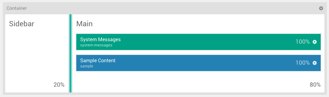
There is also a container that wraps around the whole section, including the big grid. This container allows you to hook into it as you would any other single section, and has a set of settings.
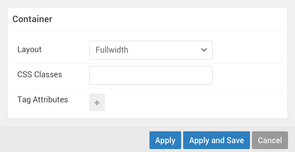
| Setting | Description |
|---|---|
| Layout | Enables you to set a Fullwidth or Boxed layout for the section. |
| CSS Classes | Enables you to add a CSS class for the Section. |
| Tag Attributes | Enables you to add HTML attributes for the Section. |
Offcanvas Section
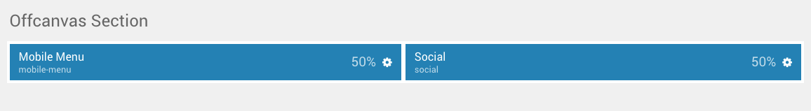
The Offcanvas section is intended to enable you to place modules and positions in a special hidden-until-opened sidebar. This sidebar houses the Mobile Menu Particle, a specialized Particle that loads the designated main menu in a way that is easy for mobile users to open and utilize.
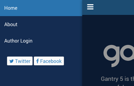
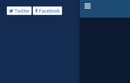
The Mobile Menu Particle is exclusively made for the Offcanvas section, though it is not the only item that can be placed here. Arranged vertically on the front end, Particles and Modules can be placed in the Offcanvas section that you would like to have appear in this area of the page. Any Particle or Module other than the Mobile Menu will be available on both mobile and desktop devices, unless designated in the item's CSS.
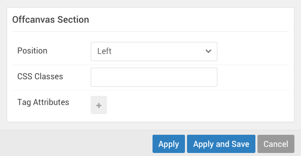
One interesting note about the Offcanvas Section is in its settings. You can set the Position where the Offcanvas section appears on the front end. This enables you to decide if you want the sections' menu button and content to come in from the right or left side of the page.
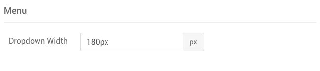
In the Styles administrative panel the Dropdown Width field sets the width of the panel (in pixels) enabling you to set how much of the screen becomes the panel when it is active.