Custom Responsive Grids in Content
Sometimes, you will want to create custom responsive content within the bounds of a simple content area. For example, within an article/post on your site, as opposed to being created dynamically through a particle.
The way this is done in Gantry 5 is a lot easier than it was in Gantry 4. Gantry 5 comes with a built-in and lightweight CSS framework that we called Nucleus. Nucleus main focus is to provide a flex-ready layout. This means that if you just follow a few rules in building your responsive layout, you will never have a problem, no matter how deep your layout is going to be.
For your content you will only need to know about 3 types of classes that come with Nucleus:
g-grid
This is the container of your content surroundings and side-by-side columns. A grid (or row), will always occupy entirely the space it's been added to. Think of it as a 100% wide div.
A g-grid can contain only g-block elements in it, nothing else. This is important in order to have the flex-grid working responsively.
g-block and size-%
This is the container of your actual content. A g-block, by default, is 100% wide and in it you can put any desired content, whether it's an image, a paragraph or even another g-grid > g-block layout.
When your g-block is accompanied by a size-% class, you can change its default 100% size. Sizes can go from 5 to 95 with a multiplier of 5.
The available custom widths are .size-5 .size-10, .size-15, .size-20, .size-25, .size-30, .size-33, .size-40, .size-50, .size-60, .size-66, .size-70, .size-75, .size-80, .size-85, .size-90 .size-95.
In mobile view, these blocks will stack on top of each other while in tablet or desktop view, these blocks will scale responsively.
When you have multiple blocks inside a grid, make sure that the size of the blocks sum up to 100%
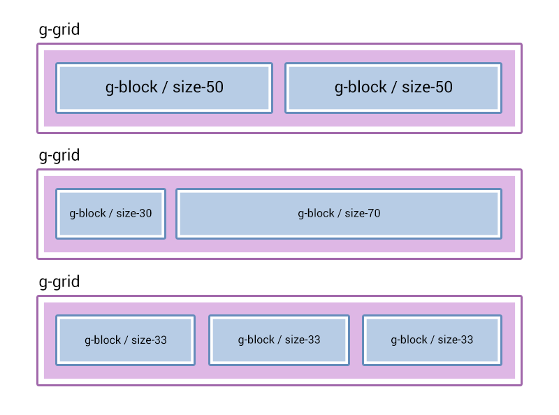
The structure is always going to be the same, first a grid then a block, inside the block goes your final content which might include another grid and another block.
.g-grid
    .g-block.size-50
        [your content for left column]
    .g-block.size-50
        [your content for right column]
Example 1
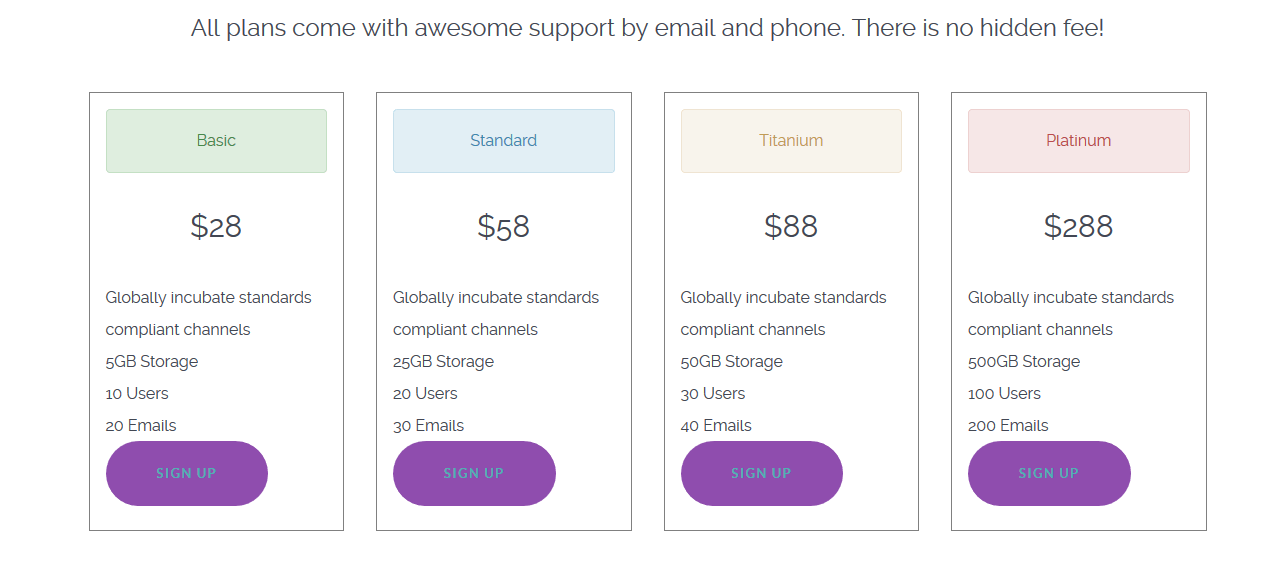
In this example we create a one row/four column pricing table.
<div class="g-grid">
    <div class="g-block size-100">
        <h3 class="center">All plans come with awesome support by email and phone. There is no hidden fee!</h3>
    </div>
</div>

<div class="g-grid">
    <!-- Column1 - Basic -->
    <div class="g-block size-25 equal-height">
        <ul style="list-style: none; border: 1px solid gray; padding: 1rem; margin: 1rem;">
            <li class="alert alert-success center">Basic</li>
            <li class="center"><h2>$28</h2></li>
            <li>Globally incubate standards compliant channels</li>
            <li>5GB Storage</li>
            <li>10 Users</li>
            <li>20 Emails</li>
            <li class="button button-2"><a href="#">Sign Up</a></li>
        </ul>
    </div>
    <!-- Column2 - Standard -->
    <div class="g-block size-25 equal-height">
        <ul style="list-style: none; border: 1px solid gray; padding: 1rem; margin: 1rem;">
            <li class="alert alert-info center">Standard</li>
            <li class="center"><h2>$58</h2></li>
            <li>Globally incubate standards compliant channels</li>
            <l>25GB Storage</li>
            <li>20 Users</li>
            <li>30 Emails</li>
            <li class="button button-2"><a href="#">Sign Up</a></li>
        </ul>
    </div>
    <!-- Column3 - Titanium -->
    <div class="g-block size-25 equal-height">
        <ul style="list-style: none; border: 1px solid gray; padding: 1rem; margin: 1rem;">
            <li class="alert alert-warning center">Titanium</li>
            <li class="center"><h2>$88</h2></li>
            <li>Globally incubate standards compliant channels</li>
            <li>50GB Storage</li>
            <l>30 Users</li>
            <li>40 Emails</li>
            <li class="button button-2"><a href="#">Sign Up</a></li>
        </ul>
    </div>
    <!-- Column4 - Platinum -->
    <div class="g-block size-25 equal-height">
        <ul style="list-style: none; border: 1px solid gray; padding: 1rem; margin: 1rem;">
            <li class="alert alert-error center">Platinum</li>
            <li class="center"><h2>$288</h2></li>
            <li>Globally incubate standards compliant channels</li>
            <li>500GB Storage</li>
            <li>100 Users</li>
            <li>200 Emails</li>
            <li class="button button-2"><a href="#">Sign Up</a></li>
        </ul>
    </div>
</div>
Example 2
This is a straight forward example of a one row/four column presentation of alternating text content and images.
<div class="g-grid">
    <div class="g-block size-100">
        <h3 class="center"><a href="#">Free <strong>10 days trial</strong> on all plans. No credit card needed! Need a bigger plan?</a></h3>
    </div>
</div>
<div class="g-grid">
    <!-- Row1 Column1 - Text -->
    <div class="g-block size-25">
        <a href="#">Dropdown Menu</a>
        <p>A Dropdown Menu system, with inline icons, multiple columns and much more.</p>
        <p>
            <a href="#" class="button button-3 button-small">Learn More</a>
        </p>
    </div>
    <!-- Row1 Column2 - Image -->
    <div class="g-block size-25">
        <div style="margin: 1rem;">
            <img src="images/sampledata/parks/animals/800px_koala_ag1.jpg" alt="image">
        </div>
    </div>
    <!-- Row1 Column3 - Text -->
    <div class="g-block size-25">
        <a href="#">Positions</a>
        <p>Unlimited positions, with drag and drop add, delete, move and resize capabilities.</p>
        <p>
            <a href="#" class="button button-3 button-small">Learn More</a>
        </p>
    </div>
    <!-- Row1 Column4 - Image -->
    <div class="g-block size-25">
        <div style="margin: 1rem;">
            <img src="images/sampledata/parks/animals/800px_koala_ag1.jpg" alt="image">
        </div>
    </div>
</div>
The images used in our examples are based on ones that appear in the default Joomla installation. Your particular CMS / installation may differ. Any image links should be replaced with ones that reflect your own files.
You can see by these images how g-grid and g-block references are used. Grids form horizontal spaces and blocks are columned content within the grid. Size variables size-25 determine what percentage of width each block takes up. So, for example, you would pair a size-75 block with a size-25 to create a horizontal space with a large left-hand column and a smaller right-hand column.