Creating Layout Presets
Layout Presets are the basic building blocks the Layout Manager uses as a starting point for you to customize the layout of your site. Each preset gives you a new set of sections, each linked to styling, making up the look and feel of the site. You can then place Particles and Positions into these sections, add rows, and arrange the page the way you would like it to look.
If you're not finding a preset that meets your needs, you can create a new one.
It is very easy for a skilled developer to create a Layout Preset. This is a great way to take an existing Layout Preset and add or remove Sections to it, or to build an entirely new Layout Preset from scratch, if you are so inclined.
Unlike adding rows in a section, creating an entirely new section (either stand-alone or as a sidebar) gives you the ability to create custom CSS styling affecting the new area of the page.
It's important to note that this is an advanced action, and Gantry 5 themes generally do not include built-in styling support for new sections. You will have to add the styling yourself, either linking it to an existing section or creating it from scratch in your custom.scss file located in THEME_DIR/custom/scss.
Preset Images
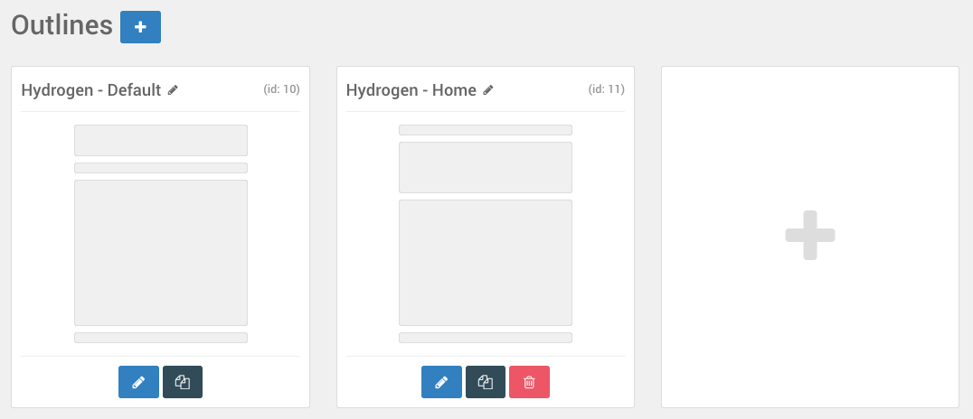
There is a section of the YAML files for the layout presets that deals with the preset image. This is an important part of the file as it creates the preview image you see when you are browsing the Outlines administrative interface. It can serve as a quick reference to the outline, giving you an at-a-glance look at what the layout looks like without having to visit the layout manager.
Gantry includes a set of these images that you can choose from. They are located in the SITE_ROOT/administrator/components/com_gantry5/images/layouts/ directory and can be easily referenced with a stream link. For example, if you wanted to link to the 2-col-left.png file in that folder, you would use the URL: gantry-admin://images/layouts/2-col-left.png as the preset image.
You can also add custom images. For example, let's say we have example.png and we want to use it as the preset image. We would place it in /templates/TEMPLATE_DIR/custom/images/admin/layouts and reference it in the YAML file as gantry-media://admin/layouts/example.png.
There is a section of the YAML files for the layout presets that deals with the preset image. This is an important part of the file as it creates the preview image you see when you are browsing the Outlines administrative interface. It can serve as a quick reference to the outline, giving you an at-a-glance look at what the layout looks like without having to visit the layout manager.
Gantry includes a set of these images that you can choose from. They are located in the SITE_ROOT/wp-content/plugins/gantry5/admin/images/layouts/ directory and can be easily referenced with a stream link. For example, if you wanted to link to the 2-col-left.png file in that folder, you would use the URL: gantry-admin://images/layouts/2-col-left.png as the preset image.
You can also add custom images. For example, let's say we have example.png and we want to use it as the preset image. We would place it in THEME_DIR/custom/images/admin/layouts and reference it in the YAML file as gantry-media://images/admin/layouts/example.png.
There is a section of the YAML files for the layout presets that deals with the preset image. This is an important part of the file as it creates the preview image you see when you are browsing the Outlines administrative interface. It can serve as a quick reference to the outline, giving you an at-a-glance look at what the layout looks like without having to visit the layout manager.
Gantry includes a set of these images that you can choose from. They are located in the user/plugins/gantry5/admin/images/layouts/ directory and can be easily referenced with a stream link. For example, if you wanted to link to the 2-col-left.png file in that folder, you would use the URL: gantry-admin://images/layouts/2-col-left.png as the preset image.
You can also add custom images. For example, let's say we have example.png and we want to use it as the preset image. We would place it in THEME_DIR/custom/images/admin/layouts and reference it in the YAML file as gantry-media://images/admin/layouts/example.png.
Creating a New Layout Preset
Creating a new Layout Preset is pretty simple. The first thing you will need to do is create a new YAML file in THEME_DIR/custom/layouts. For our example, we will name this file example1.yaml.
Here is the example code that will be in our new YAML file:
version: 2

preset:
  image: gantry-admin://images/layouts/default.png

layout:
  /header/:
    -
      - menu

  /main/:
    -
      - position-breadcrumbs
    -
      - system-messages
    -
      - system-content

  /mainbottom/:
    -
      - position-mainbottom

  /footer/:
    -
      - position-footer
    -
      - copyright 40
      - spacer 30
      - branding 30

  offcanvas:
    -
      - mobile-menu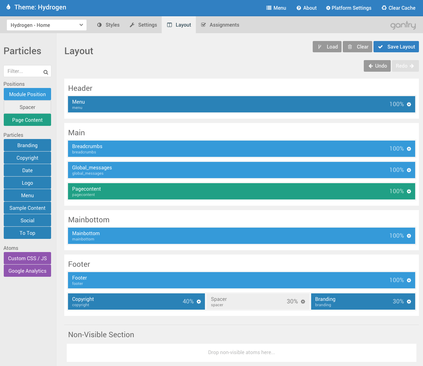
This is a basic layout preset, featuring three sections included in the theme's original styling (header, main, and footer) with one additional section being added (mainbottom) that is not included with the original theme. We don't recommend adding new sections if you don't have to, but doing so can be done by adding it in a custom Layout Preset.
Once you have added a new section, it will display without any styling beyond the template's defaults. To add your own styling, you will want to do so via the custom.scss file located in THEME_DIR/custom/scss. For example, if you wanted the H1 tag to output a red font, you would add the line #g-mainbottom h1 {color: red;}.
Gantry sections appear in scss under the tag g-(section name). The main section would be g-main, as an example. This is done to separate your section names from other potentially conflicting third-party styling assignments.
How to Create a Sidebar Section
In this section, we will explain how to create a new Layout Preset with double sidebar. Each sidebar section represents a block within the grid container that makes up the Main, Sidebar 1, and Sidebar 2 sections. You can find more information about how sidebars work in the Sidebar Blocks and Grids section of the Layout Manager guide.
The first thing you will need to do is create a new YAML file in THEME_DIR/custom/layouts. For our example, we will name this file example2.yaml.
Here is the example code that will be in our new YAML file:
version: 2
preset:
image: gantry-media://images/admin/layouts/3-col-right.png
layout:
/header/:
-
- menu
/container-main/:
-
- main 60:
- position-breadcrumbs
- system-messages
- system-content
- sidebar1 20:
- social-5876
- position-sidebar
- position-right
- sidebar2 20:
- social-8937
- position-sidebar2
- position-right2
/footer/:
-
- position-footer
-
- copyright 40
- spacer 30
- branding 30
offcanvas:
-
- mobile-menu
structure:
sidebar1:
subtype: aside
block:
fixed: 1
sidebar2:
subtype: aside
block:
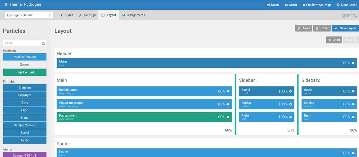
fixed: 1This is a very simple Layout Preset, giving the user Header, Main, and Footer sections in addition to two independent Sidebar sections. Each section gets its own base styling that provides the base by which added Particles and Positions are placed.
Each horizontal row needs to equal 100% width. In the example above, you will notice that main has a width set of 60%, followed by two sidebars each at 20% width. It's also very important to remember that YAML files only support spaces divisible by 2, and not tabs.
Spanning a Sidebar Across Multiple Sections
In this section, we will demonstrate two YAML files that create one and two sidebar sections that span across multiple sections of the site. This is useful in cases where you want to have additional sections, such as your header and footer, share horizontal space with the sidebar.
version: 2

preset:
  image: gantry-admin://images/layouts/2-col-right.png

layout:
  /container-main/:
    -
      -
        header:
          -
            - position-header
        navigation:
          -
            - menu
        messages:
          -
            - system-messages
        main:
          -
            - system-content
        footer:
          -
            - copyright 40
            - spacer 30
            - branding 30
      -
        aside:
          -
            - position-aside

  offcanvas:
    -
      - mobile-menu

structure:
  aside:
    block:
      fixed: 1
As you can see in the example above, we have nested multiple sections including the header, navigation, messages, and footer in the same horizontal space as the aside section, which acts as a sidebar.
In the example below, you will see a two-sidebar layout preset YAML with a sidebar to the left and an aside section to the right of multiple sections.
version: 2

preset:
  image: gantry-admin://images/layouts/3-col.png

layout:
  /container-main/:               # main container
    -                               # grid (row 1)
      -                               # block (column 1)
        sidebar:                        # section
          -                               # grid
            - position-sidebar              # block

      -                               # block (column 2)
        header:                         # section
          -                               # grid
            - position-header               # block
        navigation:                     # section
          -                               # grid
            - menu                          # block
        main:                           # section
          -                               # grid
            - system-messages               # block
          -                               # grid
            - system-content                # block
        footer:                         # section
          -                               # grid
            - copyright                     # block

      -                             # block (column 3)
        aside:                        # section
          -                             # grid
            - position-aside              # block

  offcanvas:                        # offcanvas
    -                                 # grid
      - mobile-menu                     # block

structure:
  aside:
    block:
      fixed: 1
Syntax Guide
There are five main rules to keep in mind when creating a layout preset.
- tiered content is ordered as
grid - block - grid - block - grid - block. Grid is a row and block is a column. See the earlier examples. foo:creates a section.wrapper-foo:creates a wrapper.container-foo:creates a container. Name needs to be unique to the layout.- Adding slashes (example:
/foo/:) enables you to take advantage of section layout settings for improved styling flexibility. - Multiple particles in a row can also be put within
[ ]brackets. Example:- [logo, menu] - You don't need brackets or extra dash for single-particle rows. Example:
- menuis the shorthand of- [menu]
Common YAML Items
| Item | Description |
|---|---|
system-messages |
Inserts a System Messages position which displays system messages on the front end. |
system-content |
This line displays content on the page provided by the CMS. It is the content body. |
position- |
Followed directly by a position name (example: position-header) it creates a position and assigns it the given name. |
version |
This indicates the Gantry YAML version being used. Version 2, for example, was introduced in Gantry 5.2. |
Adding a Section to an Existing Layout Preset
There are two ways to go about adding a section to an existing layout preset. The first applies to layout presets that are already present in your THEME_DIR/custom directory.
You can edit the custom preset directly, or duplicate its YAML file and edit the duplicate if you want to keep the current preset and have another with a minor change.
So, let's say that you have a file named example1.yaml in your THEME_DIR/custom directory. And that file contains the following:
version: 2

preset:
  image: gantry-media://images/admin/layouts/default.png

layout:
  /header/:
    -
      - menu

  /main/:
    -
      - position-breadcrumbs
    -
      - system-messages
    -
      - system-content

  /footer/:
    -
      - position-footer
    -
      - copyright 40
      - spacer 30
      - branding 30

  offcanvas:
    -
      - mobile-menu
This layout preset establishes header, main, and footer sections. But, let's say you wanted to add a new section between the main and footer named mainbottom. Doing this is incredibly easy. Just add the following between the main and footer sections in the file:
  /mainbottom/:
    -
     - position-mainbottom
Once this is done and the file is saved, refresh your Layout Manager and load the preset. Your change should appear.
You can also add a section to an existing layout using a very similar process. You just need to copy the layout's YAML file from its original location and place it in your /custom directory. For example, you can copy THEME_DIR/layouts/default.yaml and place the copy in THEME_DIR/xxx/default.yaml directory and make your change(s) to the copy.
Structure
There is another section in a layout preset's YAML file that sets the structure of the layout. This is the structure section. This section sets the structural properties of your layout. They are the bits and pieces that can not defined in the main layout area where you initially create your sections and assign particles.
A YAML's structure leaves a lot of room for new properties to be assigned to virtually any element in the layout's structure. For example, you can change the behavior of a section using the structural properties, such as changing a section's type to a div rather than its default behavior: section.
There are five different types of properties. id, title, type, subtype, and attributes. A section's assigned id determines its tags. For example, an id of foo will appear as <section id="foo"> in the front end. The id is an internally-used feature that should not be altered manually.
The title property enables you to set a title for the seciton as it appears on the back end. For example, you can set the section up as follows:
structure:
mainbottom:
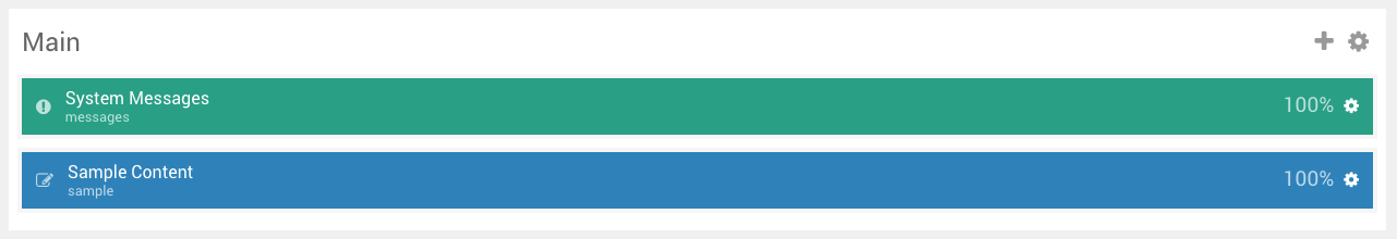
title: MainAnd it will appear as Main in the back end as pictured below:
attributes are the changes made in the section's settings in the Gantry administrator. For example, if you set the section settings in the Gantry admin as follows:
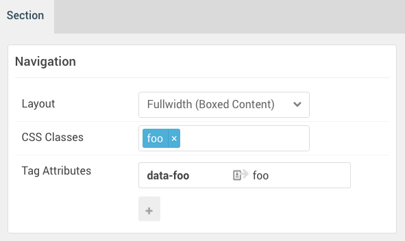
It will appear in the customized YAML file as follows:
  navigation:
    attributes:
      boxed: '0'
      class: foo
      extra:
        -
          data-foo: foo
Here is a list of structural properties you can use to define a section's type and subtype:
| Type | Description |
|---|---|
| block | This is the container of the particle. In admin, it is seen as the Block tab in each particle's settings. |
| container | A container is used to house multiple sections, such as a mainbody and sidebar/aside. |
| grid | A grid is essentially the row. Each row can contain multiple blocks. It defines the properties of a specific row. |
| offcanvas | Offcanvas describes the area that houses the mobile menu. |
| section | A section contains rows (grids), which contain blocks with particles. It is the big white blocks that show up in the admin. Commonly given names like Header, Footer, Mainbody, and Sidebar. |
| wrapper | A wrapper is not seen in the admin. It's not required in the layout, but it can be used optionally to assist in styling. For example, if you have multiple sections you want to span a single background image throughout, you can do so using a wrapper. |
Subtypes
- article
- aside
- div
- footer
- header
- main
- nav
- section
Subtypes are essentially HTML tags that define the content of your page. They are thematic groupings that tell browsers and web crawlers what pieces of content are. For example, an article would be defined within <article></article> tags.
Subtypes are only used for the section. If you have a section defined as section, then the other subtypes are not used.
Here is a quick example of a section using these structural properties to further customize the section.
structure:
  header:
    title: Main Header
  navigation:
    subtype: nav
    title: Main Navigation
In the above example, we see two sections: header and navigation. The header has been given an alternate title of Main Header. It will appear in the HTML as <header>. We did not have to assign the header subtype because the name of the section itself is header. It automatically does this for us.
The navigation section has been given the subtype of nav. We also changed its title, as we did in the header section, so it will appear as Main Navigation in the Gantry admin. The front end HTML tags appear as <nav id="g-navigation"> which uses the defined subtype and the default id.
Content
The content area of the YAML file is essentially the storage place of any particle attributes. As an example, we created a Date particle and adjusted its Particle and Block settings:
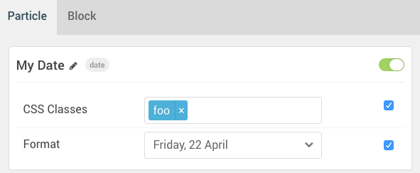
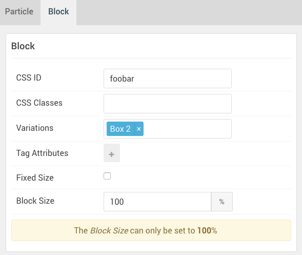
This is how this is represented in the content section of the YAML file:
content:
  date-1446:
    title: 'My Date'
    attributes:
      css:
        class: foo
      date:
        formats: 'l, d F'
    block:
      variations: box2
Note that you can put all the block settings inside block attribute.
Named grids and blocks
Sometimes there is a need to add named grid or a block to attach an id or a class to it.
version: 2

preset:
  image: gantry-media://images/admin/layouts/default.png

layout:
  /header/:
    grid-menu:
      - menu
    1:
      - logo
    2:
      - position-menu

structure:
  grid-menu:
    attributes:
      id: my-menu-id
      class: menu-grid
Note that you cannot mix dashes and named keys so if you do not want to name all the grids, use unique (or growing) integer numbers as the other keys instead.
You can also do the same with blocks, but its rarely needed as you can insert the block attributes into section and particle.
Inheritance
Starting from Gantry 5.3 there is a new inherit attribute for both sections and particles.
Section inheritance is slightly simpler, having just outline and include attributes:
structure:
  navigation:
    type: section
    inherit:
      outline: default
      include:
        - attributes
        - block
        - children
Particle inheritance has additional parameter to specify which particle to inherit from:
content:
  logo-5216:
    inherit:
      outline: default
      include:
        - attributes
        - block
      particle: logo-4270
YAML Versions
As Gantry 5 evolved, we wanted to make its layout YAML files easier to read and use. By simplifying the syntax, removing particle tags, and simplifying the way sections are managed, we were able to create a better user experience. These changes were implemented in Gantry 5.2 and later versions.
Because this update would break YAML files created with the original YAML style, we opted to add a version designation that lets Gantry know which YAML style is being used in a given file.
In short, any YAML preset file created after Gantry 5.2 using the new (current) YAML style should have version: 2 as the first line. Otherwise, Gantry will default to the original YAML syntax.