Layouts
The Layouts panel in the Gantry-based template administration interface provides several options for configuring the layout of the template. Each modular section of the template design offers six module positions by default
To find out about Layouts and Module Widths, check out this quick screencast. It covers some of the basic concepts involved in understanding and configuring layout with a combination of module configuration and Gantry layout control.
Using Layouts
Each of the major module rows/sections is represented with a slider to allow for dynamic control over how modules are laid out -- based on how many module positions are in use or published. By default, the layout will be an equal size for the published modules.
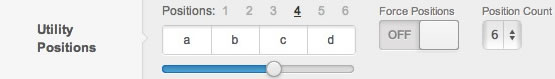
Number links from one to six sit on top of the slider which represent the number of positions you want to configure for. For example, if you are setting up the layout for a page which has four positions in use, you will want to first select the #4 link at the top of the slider for that position.
If you had modules in 4 different module positions: utility-a, utility-b, utility-c, and utility-d, that would mean your active positions would be 4. The layout widget will always show you the current number of active positions in bold. Below that number, you see a block representation of the current layout.
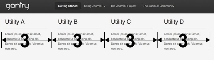
We use a system based on Twitter's Bootstrap. The layouts are based 12, and by default, the 12 column 3 | 3 | 3 | 3 of the default setting translates into an equal sized block for each of the four module positions you have active or published.
Based on the 12-column layout with 4 modules of equal width published, the front-end will look like this:

When you slide the slider bar below to select different widths for these 4 positions, a tooltip on the side will also show you the numeric value of the configuration.
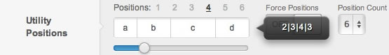
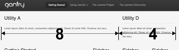
In this case, you can see we have dragged the slider to the left and have chosen the layout 2 | 3 | 4 | 3, which means that module position utility-a is assigned 2 grids, utility-b is assigned 3, utility-c is assigned 4 and utility-d is assigned 3 grids. After hitting Apply or Save, this will cause the front-end's layout to change and display this:
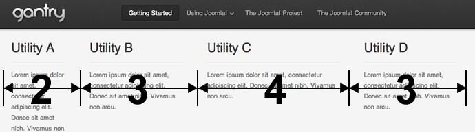
You can see the 2 | 3 | 4 | 3 proportions have been applied to the layout. Gantry is so flexible that you can configure different layouts for different numbers of module positions. Joomla has the ability to show different modules on different menu items so you may, for example, have 4 modules published on your Home menu item, but only 2 modules published on one of your internal pages. To accommodate this, you can merely click the 2 in the Positions list and choose a layout that suits your needs:
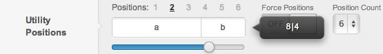
This will translate into a 8 | 4 or worded another way -- a 2/3 and 1/3 distribution of the 2 modules:
Each of the major widget positions is represented with a slider to allow for dynamic control widget layout. This is based on how many widgets are placed in that position. By default, placed widgets will be displayed at equal sizes.
At the top of the slider are numbered links from 1 to 6 which represent the number of placed widgets you want to configure for. For example, if you are setting up the layout for a position which has four widgets in use (split using three Gantry Divider widgets), you will want to first select the #4 link at the top of the slider for that position.
If you had four widgets in one position separated with the Gantry Divider widget, your active positions would be 4. The layout slider will always show you the current number of placed widgets in that position. Below that number, a block representation of the current layout is displayed.
We use a system based on Twitter's Bootstrap. Layouts are base 12, and by default, the 12 column 3 | 3 | 3 | 3 of the translates to an equal sized block for all four widgets place in the position.
Based on the 12-column layout with four widgets of equal width published, the front-end will look like this:
When you slide the slider bar below to select different widths for these 4 widget columns, a tooltip on the side will also show you the numeric value of the configuration.

In this case, we have positioned the slider to the left and selected the layout 2 | 3 | 4 | 3, which means that widget column utility-a is assigned 2 grids, utility-b is assigned 3, utility-c is assigned 4 and utility-d is assigned 3 grids. After hitting Save, this will cause the front-end's layout to change and display:

You can see the 2 | 3 | 4 | 3 proportions have been applied to the layout. Gantry is so flexible that you can configure different layouts for different numbers of placed widgets in a position. Gantry also has the ability to show different widgets on different overrides, so you may have 4 widgets placed on your Home page, but only 2 widgets placed on one of your internal pages, for example. To accommodate this you can merely click the 2 in the Positions list and choose a layout that suits your needs:

This will translate into a 8 | 4 or worded another way, a 2/3 and 1/3 distribution of the 2 widgets:

Mainbody Layouts
The layouts for the mainbody area is slightly different from the other module layouts. The primary difference is that the mainbody is generally displayed along with up to 3 sidebars. This provides the ability for a Gantry-powered template to effectively support a four-column layout. We researched a wide variety of sites and determined that more than four columns for a layout is very rare, and quickly becomes unreadable due to the limited amount of space available. Generally speaking, two or three columns is the preferred layout for a modern website.
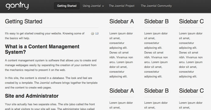
The layout for this is controlled in the template parameters. As you can see below, the widget understands that there are three sidebar columns published. So, when the mainbody is taken into account, this creates a four-column layout. The current configuration is set to 6 | 2 | 2 | 2 where the mainbody is using six grid units, and the three sidebars each use two. This adds up to the 12-grid system we are using in this example.

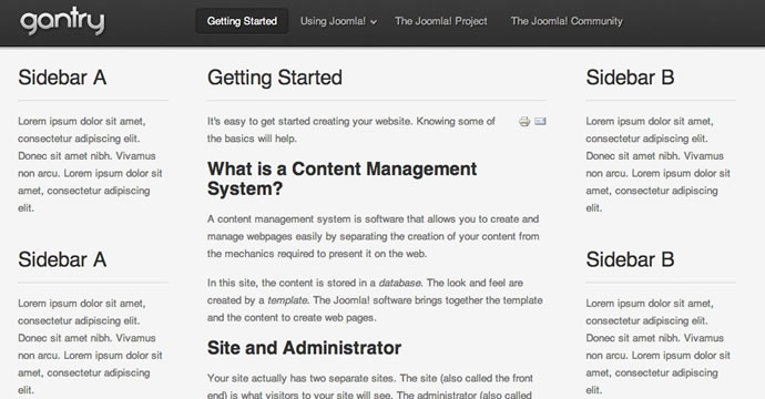
If you drag the slider to the right, you will see the positions shuffle around and give different options for where the mainbody is displayed in addition to various widths for each. With four total columns, there is not much room to have widely-varying column widths, so let's turn off one of the columns by disabling the modules in the sidebar-c module position using our module manager. Below, you will see how the default layout is currently set to display when we have only two sidebars published:
If you drag the slider to the right, you will see the positions shuffle around to display different layout options for the mainbody. With four total columns, there is not much room to have widely varying column widths. So, we will turn off one of the columns by removing one of the Gantry Divider widgets in the sidebar position using the WordPress widget manager. Below, you will see how the default layout is currently set to display when we have only two sidebars:

As you can see, it's set for the two sidebars to be displayed on the right (each taking up two grid units) while the mainbody is on the left occupying eight grid units. Dragging the slider to the right will provide a wide variety of layout options. As you can see below, this example shows a layout of 3 | 6 | 3, where the mainbody is in the middle:

After clicking the Save or the Apply button in the toolbar, you will be able to see this layout applied to the frontend:
WordPress Options
Gantry Divider Widget
Gantry Divider is a widget used to tell Gantry where you want to split your widget position and create another column. It is exclusive to the WordPress platform as it is used to create a break between the widget columns in a given position. The Joomla equivalent of this would be accomplished by assigning a module to a specific column (a, b, c, etc.).
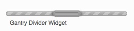
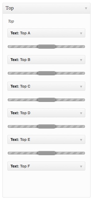
If you placed two widgets in one position, they will be displayed in one column in two rows (one above another), but if you're going to place a Gantry Divider Widget between them, they'll be displayed in two columns (one next to each other) with widths set in the Layout settings of that position (for two-widget columns variation). The example below shows the setup where six widgets will be displayed in six columns within a single position.
The same rule applies to the MainBody layout configuration. Splitting your sidebar widgets with one Gantry Divider will result in breaking them into a two sidebar layout, exactly in the place where you placed your divider widget. A three-sidebar layout is just a matter of adding a second Gantry Divider widget in the sidebar widget position.