Particle YAML Field Types
When you are creating a new Particle, you might notice that the input fields you set in the Particle's YAML file vary, depending on what you are trying to accomplish.
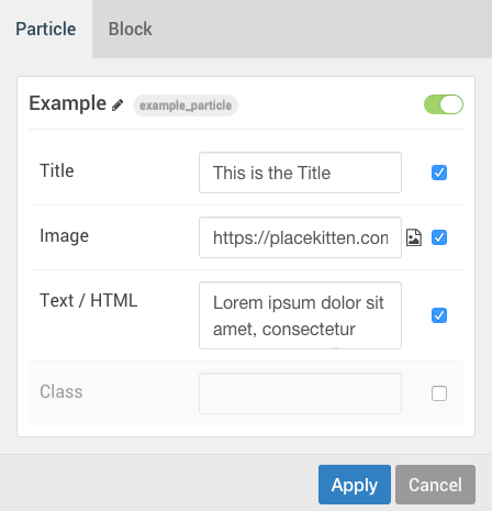
In the above screenshot, you will notice several different types of input fields are present. Even the green switch in the upper-right corner is a field set in the YAML file.
Here is the Particle's YAML file:
name: Example
description: Displays a Title, Image, and Text on the front end.
type: particle

form:
  fields:
    enabled:
      type: input.checkbox
      label: Enabled
      description: Globally enable to the particles.
      default: true

    title:
      type: input.text
      label: Title
      description: Customize the section title text.

    image:
      type: input.imagepicker
      label: Image
      description: Select the main image.

    description:
      type: textarea.textarea
      label: Text / HTML
      description: Create or modify your description.

    css.class:
      type: input.text
      label: Class
      description: CSS class name for the particle.
There are several different field types represented in this example. input.checkbox, input.text, input.imagepicker, and textarea.textarea can be found in the example above. Below, we have detailed the core field types included with Gantry 5.
HTML Input Field Types
There are two main types of inputs supported by Gantry. The first are basic HTML input types. Gantry supports them for simplicity sake, making it easier for you to create Particles that take advantage of everything HTML has to offer. These types include:
- collection.list
- input.checkbox | Displays a checkbox (default: true=checked / false=unchecked)
    title:
      type: input.checkbox
      label: Your label.
      description: Your description.
default: true- input.color
- input.date
- input.datetime-local
- input.datetime
- input.email
- input.file
- input.group
- input.hidden
- input.image
- input.month
- input.number
- input.password
- input.radio
- input.range
- input.reset
- input.search
- input.submit
- input.tel
- input.text
    title:
      type: input.text
      label: Your label.
description: Your description.- input.time
- input.url
- input.week
- textarea.textarea
- enable.enable
Gantry-specific Input Field Types
The second are Gantry-specific types that utilize Gantry's exclusive features such as the robust Color Picker and Image Picker. These types take what the vanilla HTML input types offer and extends them to make them more powerful, easier to use, and exceptionally robust.
| Field Type | Description |
|---|---|
| input.block-variations | Enables you to select between Gantry's supported block variations, giving you a quick way to refine how the Particle appears on the front end. |
| input.colorpicker | Opens Gantry's Color Selector which enables you to quickly choose a color from tools displaying hue, saturation, brilliance, and a color wheel. |
| input.filepicker | Opens Gantry's file browser, enabling you to select a file to use. |
| input.fonts | Opens Gantry's Font Selector which enables you to view and test over 670 fonts from the Google Font Library. |
| input.icon | Opens Gantry's Icon Selector which displays and enables you to select FontAwesome icons to use in the field. |
| input.imagepicker | Opens Gantry's file browser, enabling you to select an image to use. |
| input.videopicker | Opens Gantry's file browser, enabling you to select a video file to use. |
| select.selectize | Displays a pre-created set of options for the user to choose from. |
| select.date | Displays a pre-created set of date formats for the users to choose from. |
WordPress-specific Input Field Types
There are also WordPress-specific types.
| Field Type | Description |
|---|---|
| wordpress.posts | Enables a field to select WordPress posts. In setting up the field you can specify post type (defaults to page) and status (defaults to publish). |
| wordpress.categories | Enables a field to select WordPress categories (as used in the WordPress Posts particle). |
Selectize Fields
select.selectize and select.date both require a bit of additional setup in the Particle's YAML file to work properly in the Gantry administrator. Below is an example of a select.selectize field type from a Particle's YAML field.
target:
      type: select.selectize
      label: Target
      description: Target browser window when item is clicked.
      placeholder: 'Select...'
      default: _blank
      options:
          _parent: Self
          _blank: New Window
Using Selectize multiple times in a single page can affect performance. If you are in a situation where you need to use this input type multiple times in a small space, you could try select.select as an alternative. It has roughly the same capability with less performance overhead. A good rule of thumb is that if you don't need the search function, you should use select.select.
You will notice the options settings listed here. In this case, the values of _parent and _blank are used with the tags of Self and New Window. The user will see the tags in the Gantry administrator. Selecting one or another sets the value of the field to the option's associated value.
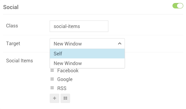
As you can see, the user experience in the Gantry administrator is more natural and easier on the user. Instead of entering the target window for a link manually, they simply select between these two preset options, which feeds into the Particle's Twig file during page rendering.
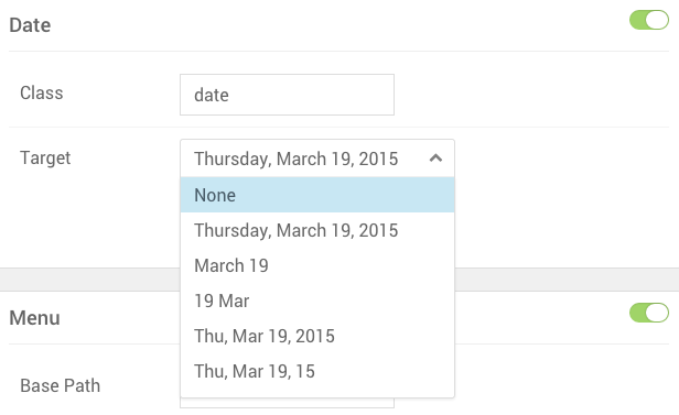
Using the select.date field type is very similar. The difference here is that you are giving someone an option in how dates appear. In the example below, we have set up a variety of different options.
date.formats:
      type: select.date
      label: Target
      description: Select preferred date format.
      default: l, F d, Y
      placeholder: 'Select...'
      selectize:
        allowEmptyOption: true
      options:
        '': None
        'l, F d, Y': Date1
        'F d': Date2
        'd M': Date3
        'D, M d, Y': Date4
        'D, M d, y': Date5
        'l': Date6
        'l j F Y': Date7
Below is how these YAML settings appear in the Gantry 5 administrator.
Gantry Alerts, Notes and Styling
Next to the standard HTML and Gantry inputs there are also a lot of other inputs. These inputs can be used to alert users or to simply add a bit of styling to the Gantry admin. With notes, you can create subsections and add more information directly available for the user. The following types are included:
- separator.note
   title:
      type: separator.note
      class: alert alert-info
      content: '<h1>Your HTML GOES HERE</h1><p>Write what you want!</p>'
Change the class of the separator.note to any class that corresponds with your template. Standard classes are:
      class: alert alert-success
      class: alert alert-info
      class: alert alert-warning
      class: alert alert-danger
There are a lot of different options available to you. As you can tell from this short guide, Particles are a powerful part of Gantry's core functionality, and can utilize a number of features to make life easier on your user.
Particle Settings Tabs
This feature is only available in Gantry 5.3.2 and later.
If you have a particle that has a lot of configuration settings on the back end, you can (in Gantry 5.3.2+) choose to create tabs within the particle's back end to separate options to make them easier to navigate through and configure.
In order to accomplish this, you will create a container in the particle's YAML file to wrap tabbed data in. Here is an example of a YAML file with three simple tabs:
name: My Awesome Particle
description: Just makes everything look awesome
type: particle
icon: fa-table

form:
  fields:
    enabled:
      type: input.checkbox
      label: Enabled
      description: Globally enable this particle
      default: true

    tabs:
      type: container.tabs
      fields:
        tab_display:
          label: Display
          fields:
            inside:
              type: input.text
              label: Inside Tab 1
              description: This field is inside Tab 1

        tab_readmore:
          label: Read More
          fields:
            ...

        tab_misc:
          label: Misc
          fields:
            ...

    outside:
      type: input.text
      label: Outside After
      description: This field is outside and after the tabs
You'll notice here the use of container.tabs to establish the container that wraps three tabs. Within these tabs, you can place any fields you would normally place in your particle's admin. Any fields you wish to have consistently remain available regardless of which tab is presently selected can do so outside of the tabs container.
Because the tabs are wrapped in a container, it can be placed anywhere in the YAML. This means you can have fields before and after.
The tab's label sets the title for the tab on the back end. There is no requirement for how you label the tab in the YAML.
When using fields in tabs in Twig, you can access them normally. There is no need to reference the tab(s) at all. For example, if you wanted to print the output of the field called inside in the example above, you would just call {{ particle.inside }}. Because tabs is a container, you don't need to reference the whole structure such as {{ particle.tabs.tab_display.inside }} (<- wrong).
Your name for the tabs can also be anything. We used tab_readmore and tab_display as examples. Your tabs could be named _tab0 or santaclause. It would not affect functionality at all. A good habit would be to prefix tabs and the tab names with an underscore (_tab_display), so that at a first glance you would know you can skip those.
A collection is a field whose final value is an array. In Gantry we only have 2 collections, list and keyvalue (Tag Attributes). You are all very familiar with list. It is commonly used and allows to create entry items on the fly.
When you save a collection, your value is an array and in your Twig template you have to cycle through this array in order to extract and have access to each individual entry item. This is how a collection works and how it's meant to be used, but it's very different than a container.
A container is just a structural definition that gets used, mostly internally, to represent how the field should look like. Gantry has always had 1 container called set. We never really used it though, but it's there.
Although the YAML structure of the container is a nested list, really the blueprint is only ever cycled through internally from the Twig field, in order to actually render in the admin the same way you see in my GIF above. The actual fields inside each tab are still gonna be saved as if they were top-level. They aren't really nested within tabs from a FORM perspective.