Utility Classes
Introduction
Gantry 5 has a ton of useful utilities baked into its core. Among them are its assortment of utility classes that make it easy to quickly set up elements and have them appear how you want and when you want them to.
Responsive Utility Classes
These classes are used to hide and make visible various blocks depending on the size of the browser window used to view the page. This makes possible for you to create a seamless, yet optimized experience for a variety of devices from mobile to large desktops.
| Class | Phones | Tablets | Desktops | Large Desktops |
|---|---|---|---|---|
visible-phone |
Visible | Hidden | Hidden | Hidden |
visible-tablet |
Hidden | Visible | Hidden | Hidden |
visible-desktop |
Hidden | Hidden | Visible | Visible |
visible-large |
Hidden | Hidden | Hidden | Visible |
hidden-phone |
Hidden | Visible | Visible | Visible |
hidden-tablet |
Visible | Hidden | Visible | Visible |
hidden-desktop |
Visible | Visible | Hidden | Hidden |
hidden-large |
Visible | Visible | Visible | Hidden |

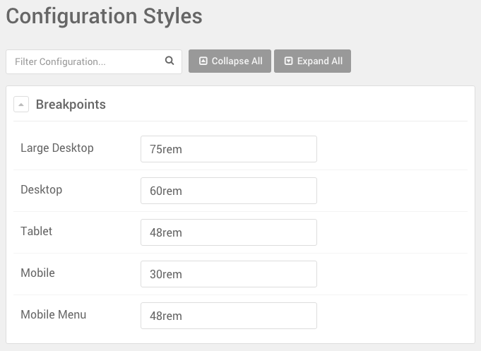
You can set the breakpoints for these classes in the Styles administrative panel. Just navigate to the bottom of the administrative panel and look for the Configuration Styles section.

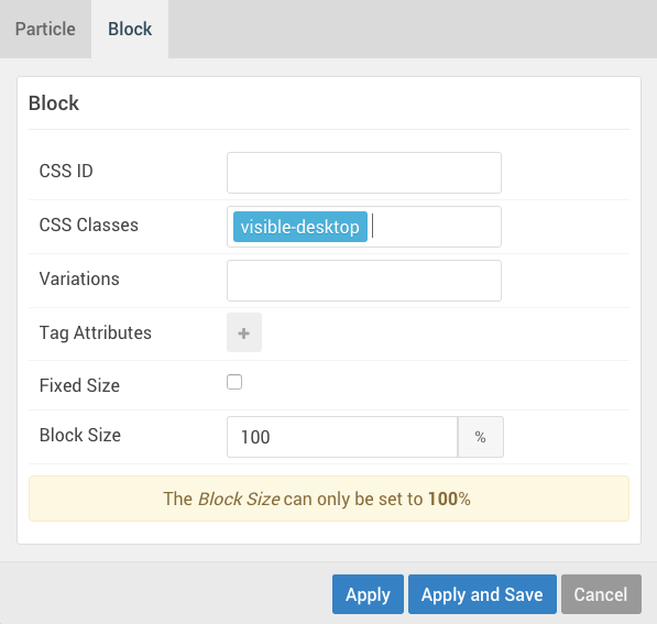
As an example, let's say you have a block that you want to appear only on desktop devices. You would enter visible-desktop in the CSS Class field of the block settings for the block.
This doesn't just affect blocks, either. You can do in-line applications such as <span class="hidden-phone">The</span> Great Gatsby to have the word "The" only appear on devices other than phones.
Padding and Margin Adjustments
This set of utility classes give you the ability to adjust the padding and margin settings for the element. They're pretty straightforward, and we have broken them down in the table below.
| Class | Description |
|---|---|
nomarginall |
Sets the margin for the top, bottom, left, and right of the element to 0. |
nomargintop |
Sets the margin for just the top of the element to 0. |
nomarginbottom |
Sets the margin for just the bottom of the element to 0. |
nopaddingall |
Sets the padding for the top, bottom, left, and right of the element to 0. |
nopaddingtop |
Sets the padding for just the top of the element to 0. |
nopaddingbottom |
Sets the padding for just the bottom of the element to 0. |
g-flushed |
Sets both the padding and margin for the element to 0. |
Utility Variations
Variations are an easy way to adjust how content is seen in the front end. These are accessible directly through the Block settings when working with a particle, position, or menu item. Instead of being added from the admin via a CSS class field, they are accessible via a drop-down menu called Variations.
Variations act as friendly preset classes, ready to be deployed wherever you need. Below is a list of variations available by default with Gantry 5.
| Variation | Description |
|---|---|
| Disabled | Reduces the opacity of the element. |
| Align Right | Aligns the element's content to the right. |
| Align Left | Aligns the element's content to the left. |
| Center | Aligns the element's content in the center. |
| Equal Height | Sets the element's height equal to the adjoining element. |
| No Margin | Sets the element's margins to 0. |
| No Padding | Sets the element's paddings to 0. |