Using Media Queries
Media queries make it possible to apply CSS only to a specific screen type. For example, if you have an element on your page that you would like to appear differently on phones than it does on a desktop.
Gantry 5 makes easy to do, and this guide will take you through the process of defining breakpoints, as well as adding media queries to your custom.scss file.
Defining Breakpoints
Because Gantry 5 gives you the ability to easily define the breakpoints between viewport types, you can create a user experience that is optimized for a wide range of device types with ease.
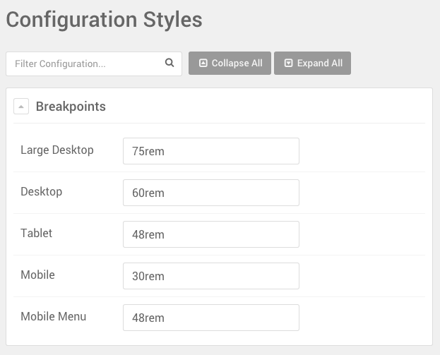
Gantry 5 templates include four key breakpoints that are defined by rem units. You can set the breakpoints in the Styles administrative panel within the Gantry 5 administrator. To access this panel, navigate to Administrator → Components → Gantry 5 Themes → Your Theme and select the Styles tab. Because this tab is Outline specific, you can change these settings on a per-outline basis.
Gantry 5 templates include four key breakpoints that are defined by rem units. You can set the breakpoints in the Styles administrative panel within the Gantry 5 administrator. To access this panel, navigate to Administrator → Theme Settings and select the Styles tab. Because this tab is Outline specific, you can change these settings on a per-outline basis.
Gantry 5 templates include four key breakpoints that are defined by rem units. You can set the breakpoints in the Styles administrative panel within the Gantry 5 administrator. To access this panel, navigate to Administrator → Gantry 5 and select the Styles tab. Because this tab is Outline specific, you can change these settings on a per-outline basis.
If you're not familiar with rem units. There is an excellent explainer below produced by Russ Weakley for SitePoint. Additionally, you can read a detailed guide from W3.
Using Media Queries on Your Site
Using your own media queries can be done very easily within your custom.scss file. You can find out more about creating this file and how it works in our detailed guide.
Below is an example of the code you would add to your custom.scss file to enable you to quickly and easily hook in to Gantry 5's breakpoints.
One important line to note is @import "nucleus/mixins/breakpoints"; which loads the _breakpoints.scss file, making the mixin breakpoint available to use.
// Gantry 5 custom CSS file

// import breakpoints
@import "dependencies";

// Typical values are the default breakpoints set in Gantry 5
// but these values are user definable in style settings
// so that is why the code below uses mixins to get the actual
// values from Gantry 5 template.

// commonly used media queries

//  typically min 75rem
@include breakpoint(large-desktop-range) {

}
// typically range 60rem to 74.938rem
@include breakpoint(desktop-range) {

}

// typically 48rem to 59.938rem
@include breakpoint(tablet-range) {

}
// typically 30rem to 47.938rem
@include breakpoint(large-mobile-range) {

}
// typically max 30rem
@include breakpoint(small-mobile-range) {

}

// Less commonly used media queries

// typically min 60rem
@include breakpoint(desktop-only) {

}
// typically min 48rem
@include breakpoint(no-mobile) {

}
// typically max 47.938 rem
@include breakpoint(mobile-only) {

}
// typically max 59.938rem
@include breakpoint(no-desktop) {

}

// Mobile Menu Breakpoint
@media only all and (max-width: $breakpoints-mobile-menu-breakpoint) { ... your css in here ... }

@import "nucleus/mixins/breakpoints";
Any CSS that you wish to apply to a specific breakpoint can be added inside the appropriate media query above.
What's Going on Behind the Scenes?
Below, you can see an example of a non-mixin version of the breakpoints styling we listed above. This should demonstrate what goes on behind the scenes, as mixins are basically shortcuts that help you avoid the tedious, more drawn-out scripting.
We highly recommend using mixins for their simplicity, however the example below will work in the event that you do not wish to use them. The example below is not all-inclusive and could break existing functionality if a theme is using media queries we've addressed below that aren't included in this example.
@import "dependencies";
// For small phones
@media all and (max-width: $breakpoints-large-mobile-container) {
}
// For big phones
@media all and (max-width: $breakpoints-tablet-container) and (min-width: $breakpoints-large-mobile-container) {
}
// For tablets
@media all and (max-width: $breakpoints-desktop-container) and (min-width: $breakpoints-tablet-container) {
}
// For medium size computer screens
@media all and (max-width: $breakpoints-large-desktop-container) and (min-width: $breakpoints-desktop-container) {
}
// For large computer screens
@media all and (min-width: $breakpoints-large-desktop-container) {
}